In this project I rebranded an art centered summer camp located in South Jersey. The design centered around the playful, artistic, and friendly mission that the camp is based around.
Appel Farms

Background
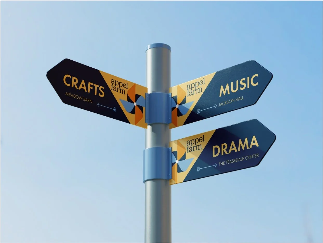
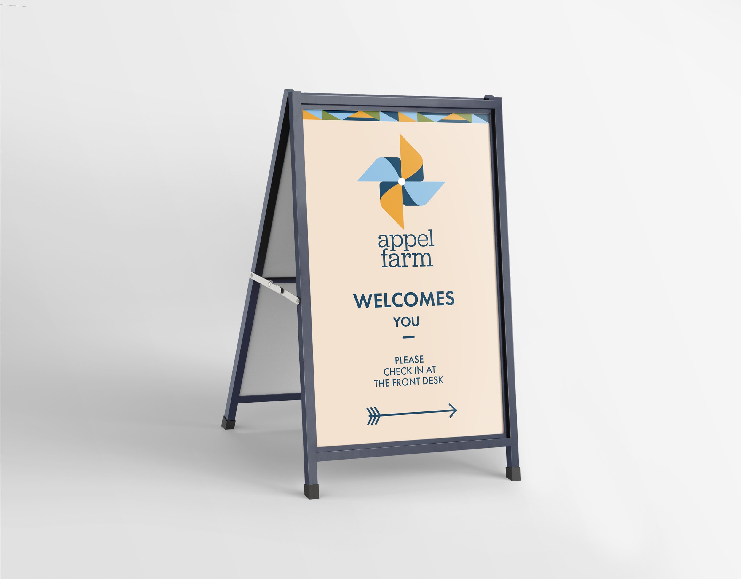
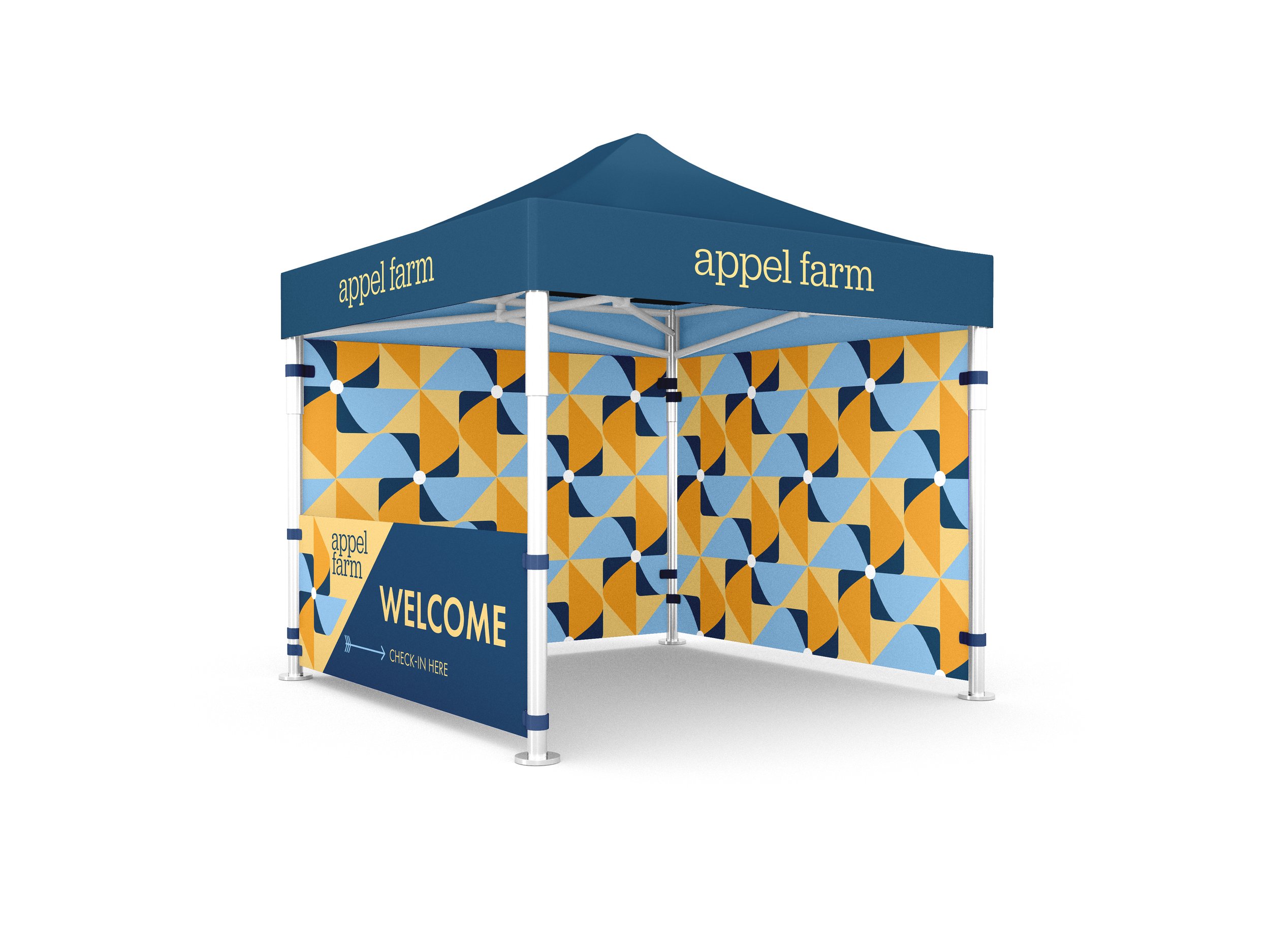
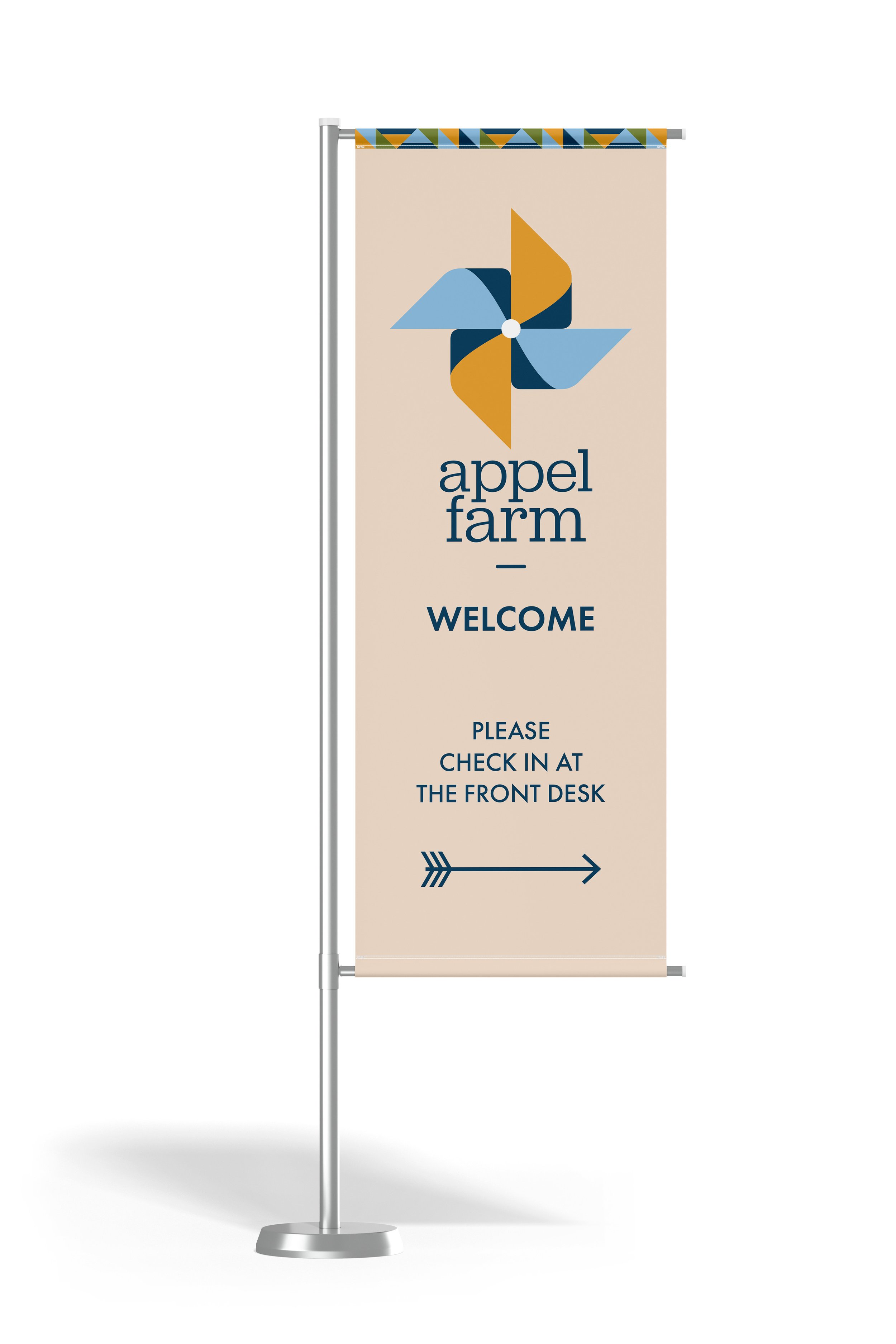
This full rebranding project allowed me to create a variety of engaging collateral, from a camp bus and wayfinding signage to paint supplies and stationery. It was an exciting opportunity to develop a strong, cohesive brand language that could be seamlessly applied across many different touchpoints.
What made this process especially rewarding was Appel Farm’s clearly defined values. Their personality and mission were already well established, giving me a solid foundation to guide the design. In the end, the project came together in a way that felt both cohesive and perfectly aligned with the camp’s vision.

The Details
Being from Minnesota, I’ve always been fascinated by barn quilts—painted designs that farmers display on their barns as a sort of crest. Each one is unique, featuring bold, colorful quilt-inspired patterns that bring a sense of tradition and artistry to their farms. I felt this concept aligned perfectly with my vision for the brand, so I paired it with a pinwheel design. This added a playful, child-centered element, making the logo feel more inviting and dynamic. The combination of the barn quilt and the pinwheel resulted in a mark that is both clever and full of energy, blending their history with a sense of fun and creativity.
The logo was designed using simple geometric shapes, making it easy to create patterns and extend the brand’s visual language. I chose an inviting color palette featuring two shades of blue and gold as primary colors, complemented by green for secondary applications and a soft cream for backgrounds. For typography, I selected a serif font as the primary typeface—it has a friendly feel, reminiscent of a typeface you’d find in an elementary school classroom, and provides a nice contrast to the clean, simple shapes of the logo. A secondary sans-serif typeface is used for readability across all touchpoints, ensuring the design remains both approachable and functional.


View More Projects
-
![Black book cover titled "America in the King Years" by Taylor Branch, decorated with red and gray squares and partial black-and-white faces.]()
Book Cover Design
-
![Abstract text collage on paper with torn black and red elements, featuring phrases like "I don't need anything from here."]()
Poster Design
-
![Framed geometric artwork with circles and lines, using blue, orange, and red colors, hanging on a wall.]()
Mixed Media
-
![Digital display of a blog page from a website, featuring articles on leadership development, including one titled 'Why You Should Teach Kids They're Leaders Now, Rather than Later,' with images and a green color scheme.]()
Website Design
-
![Appel Farm stationery set including pencils, letterhead, notebook, business card, and envelope with geometric blue and orange patterns.]()
Appel Farms
-
![Polaroid photo of a person sitting on a hill overlooking a frozen river with handwritten text "A Love Letter to the River Road."]()
Senior Thesis
-
![Two men in boxing attire with Everlast gloves pose together in a black and white photograph.]()
SAMO Art Book
-
![Restaurant menu with red and white design, featuring text "fika menu" and patterned decoration. Menu items include Swedish Meatballs, Gravad Lax, Smorgas, and Egg Salad.]()
Fika Cafe


