In this project, I aim to highlight the life of Jean-Michel Basquiat and explore how his experiences shaped his artistic vision. While many recognize him for his bold, abstract style and eye-popping auction sales, there’s a much deeper story to be told.
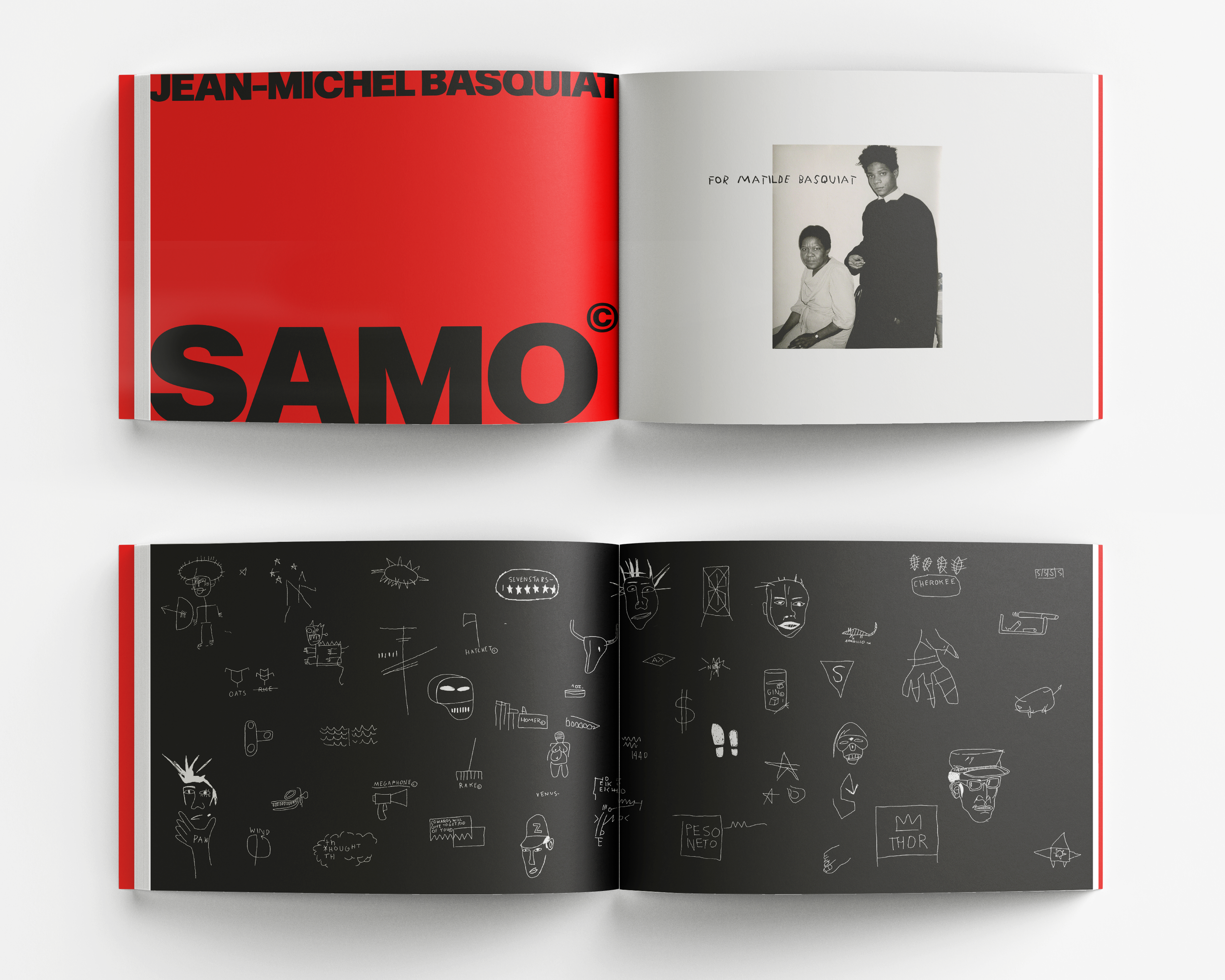
SAMO Art Book


Background
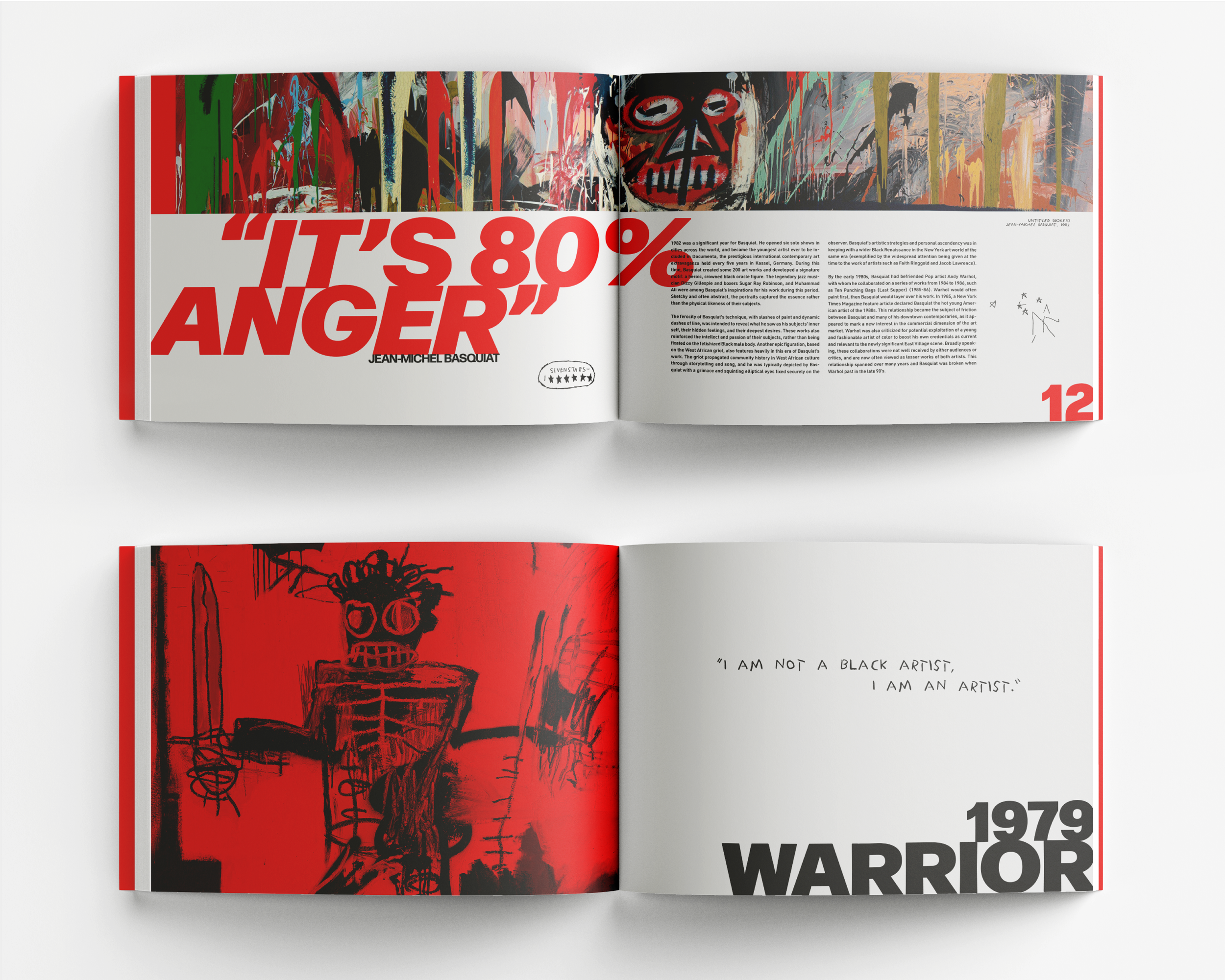
Much of Basquiat’s work reflects the deep-rooted racism that shaped American life throughout the ’60s, ’70s, and ’80s. His anger and outrage are powerfully expressed through bold compositions, rich symbolism, and striking visual impact.
With this in mind, I set out to create a design that brings these themes to the forefront—one that cuts through the viral, surface-level perception of Basquiat and instead tells his true story.
The title of the book is called “SAMO” which is an acronym Basquiat used many times throughout his paintings meaning “Same old shit”. This is a reference to racism in America and how it always remains present in our culture.

The Details
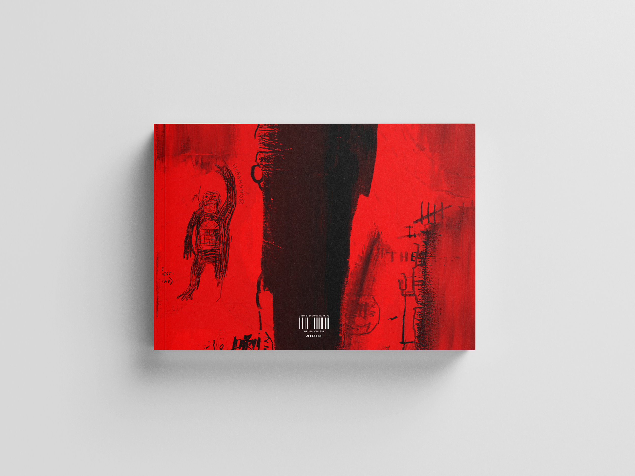
In designing *SAMO*, I wanted to break the rules and “color outside the lines,” much like Basquiat himself. I also aimed to capture his anger and disgust with American culture. To emphasize these emotions, I chose a single shade of red—a bold, unrelenting presence throughout the book. The design features a transparent red plastic book jacket, casting a red hue over everything. Each chapter is marked by a full spread of one of Basquiat’s paintings, partially obscured by this same red film. Rather than simply displaying his work as it is, I wanted to create a tactile experience—one that reinforces the intensity and raw emotion that defined both Basquiat’s art and his perspective.
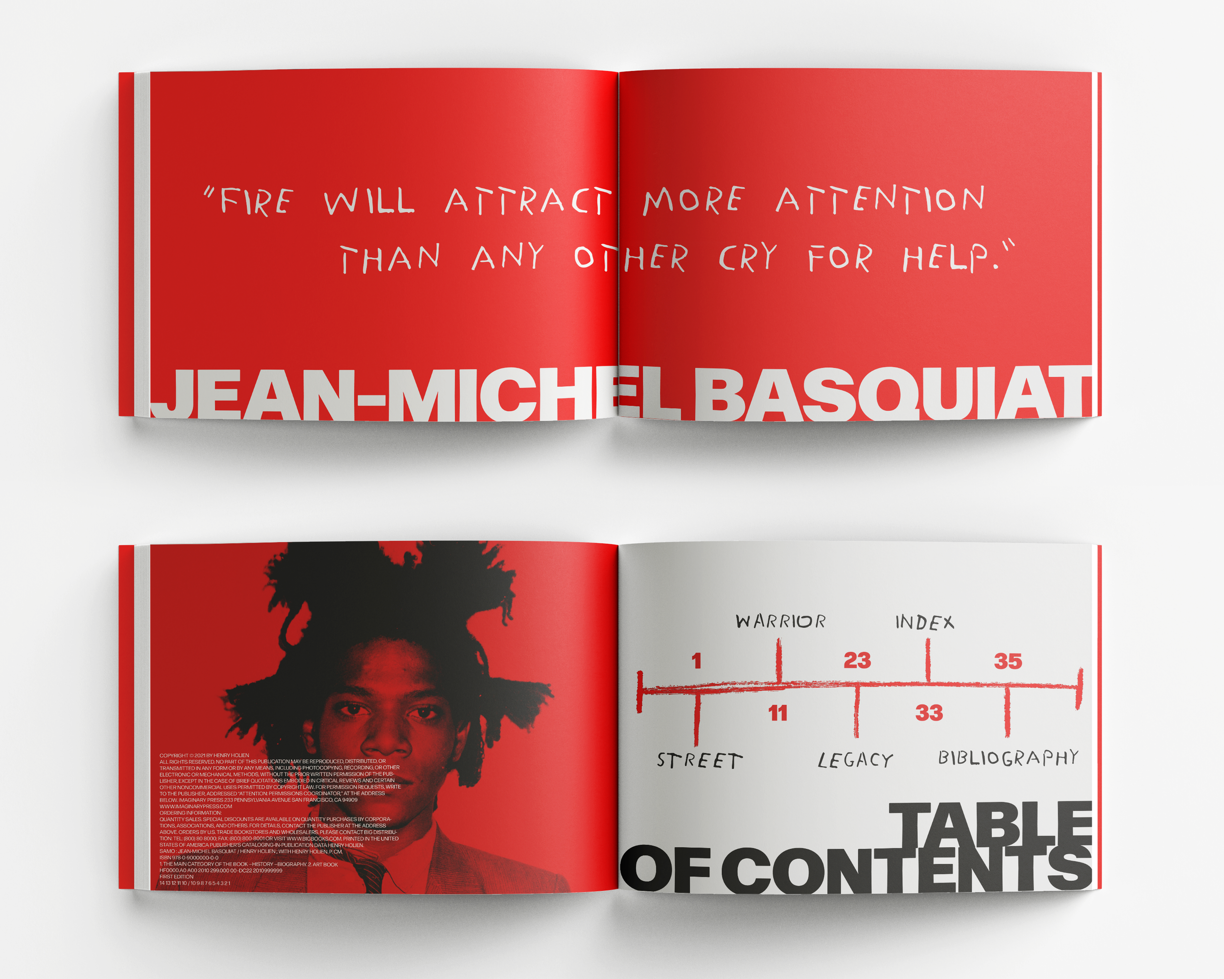
The typography is bold and dynamic, with dramatic shifts in scale to create visual impact. For the secondary typeface, I chose one inspired by Basquiat’s distinctive handwriting, using it exclusively for quotes to maintain his style. Since the book follows a chronological structure, the table of contents takes the form of a timeline—designed to feel as if Basquiat had scrawled it himself. The endpapers feature a collage of the many symbols and drawings that appear throughout his work. While his crown icon is perhaps the most recognizable, I intentionally avoided centering the design around it. Basquiat’s story is far more complex than a single symbol, and I wanted to ensure that the full depth of his work and legacy was recognized.
View More Projects
-
![Book cover of "America in the King Years" by Taylor Branch, featuring black and white with red and gray squares and small images of faces.]()
Book Cover Design
-
![Abstract art poster with layered text and visuals in black, white, and red colors, featuring the phrase "I don’t need anything from here" prominently displayed with torn collage elements.]()
Poster Design
-
![Geometric art piece with blue, orange, and red shapes in a wooden frame on a wall.]()
Mixed Media
-
![Screenshots of a website with multiple articles about leadership and self-improvement, featuring images of people in professional settings and educational themes.]()
Website Design
-
![A stationery set with a minimalist design, including a branded envelope, letterhead, notebook, pencil box with pencils, and business card, featuring geometric patterns in blue and orange.]()
Appel Farms
-
![A person sitting on a hill overlooking a snowy landscape with distant water, captured in a vintage-style Polaroid photo. The caption reads 'A Love Letter to the River Road.']()
Senior Thesis
-
![Two individuals wearing boxing gloves and shorts, posing against a plain background.]()
SAMO Art Book
-
![Restaurant menu with red cover featuring white decorative pattern and the word 'fika'. The menu lists small plates, smörgåsar, and grönsaker with items like Swedish Meatballs and Salmon.]()
Fika Cafe


